Things To Do ::
Favorite Sites ::
:: MY EXHIBITIONS
- Sharing Our Places
- Stanley Milner Gallery
- Royal Museum of Alberta
- Muttart Conservatory
- Thursday Challenge
:: Previous Page ::
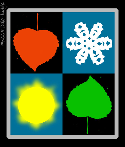
17JAN05 - Illustration Friday - The Seasons

- Holli - Lovely! Great photos too.
- Natalie - I like it, especially the representation of the two "mid seasons" as the same leaf in different positions.
- ASTRA (no link) - Beautiful (:
- erika - I love it. I enjoy the same thing Natalie does, the leaves are great. Simple change in position changes the meaning :)
- Kim - Simple but pretty. Nice work!
- matt - Great visual design. The eye keeps going round and round, as do the seasons.
Enter a comment..