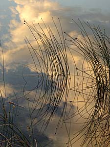
- Sharing Our Places
- Stanley Milner Gallery
- Royal Museum of Alberta
- Muttart Conservatory
- Thursday Challenge
:: Previous Page ::
- Cathal Mc Cann (no link) - Your website was very useful! Thanks
A Photographer's Notes
Introduction
I was a very inquisitive child. I loved to take things apart. I remember a beautiful shiny gold pocket watch with intricate black dials that my father had. I could not resist the urge to find out what was inside it and how it worked. I was amazed to look at all the tiny parts inside; but the only problem was, of course, that I couldn't get the watch back together again. After all these years, somehow, I conveniently forgot the reaction my father had.
What I've done in these article is to put together a number of notes I have written for myself on photography. I wrote these because I wanted to understand photography by thinking about it, not as a technical discipline, but as a particular form of communication; visual communication. By making them I wanted to capture my ideas on what one needs to know to make an image communicate a message. I guess I have allowed that inquisitive nature of mine to take apart what goes into making a photograph.
I have allowed myself to be opinionated in this article because I have the believe that opinionated ideas, even if totally wrong, are often more thought provoking and instructional than ideas that are more carefully considered.
My only concern in consciously examining what goes into photographic communication is that I won't be able to put the "watch" back together again. What I mean is that practice and trial and error are the most important teachers and that the bits and pieces of things about a subject are at best only a foundation for the deeper learning that comes through hard work.
So what are the gears, jewels, springs and screws of photography? Photography is the interpretation of a three-dimensional, no, we also going to have to include the dimension of time and movement so that means a four-dimensional, world onto a two-dimensional piece of paper or computer screen. Some of the primary "instrumentation" to do this is the control of tone, color and the relationship of the objects in the image, which I will call "space."
So let's take the back off our shiny gold pocket watch and look at the most important element of visual communication, tone.
Tone
Tone, and relationship of light and dark in an image is, in my opinion, one of the most important aspects of photography. Making an image with sparkling tone, with tone that makes an image shine with clarity, is one of the most exciting challenges of photography.

Let us begin developing our understanding of tone by considering the extremes of tone in a photograph.
Firstly, in a "high-key" photograph the subject is represented with small areas of gray and black in an almost pure white background. This style is often used for portraits of children, because white seems to many people pure, energetic, and youthful. Some nature photography is high-key simply because the subject matter, for example, snow or desert sand, is very light.
The other extreme of tone is a low-key photograph. Low-key photographs are almost completely black with small areas of light gray and white. They often work well for portraits of mature persons, because the dark tones look somber, thoughtful and considered. It's obvious that night photography is going to be low key.
Of course most photographs are neither high key or low key and their tonal relationship sits somewhere in between. To invent a term, we could call these photographs mid-key. Also, some photographs can have a combination of low and high-key areas.
Another tonal relationship that is extremely important in photography is contrast. Contrast is the difference between the light and dark areas in the photograph. Pure black against pure white would have the highest contrast. Light grey and dark grey have less contrast.
A couple more examples of levels of contrast are:
- A foggy day would have low contrast with most of the photograph being light gray.
- A landscape in bright midday sunlight would naturally have high contrast with the brightest areas of the photograph extremely lighter than the dark areas in the shadows.
A photograph that does not have enough contrast or that has too much contrast for the subject it is portraying, somehow looks wrong.
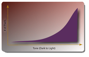
Our eyes can adjust to tremendous range of light and dark. A classic example of this would be when we looked and to a canyon or cave in bright sunlight. We can simultaneously see the detail in the shadows and in the light areas. The ability to see, or in the case of a camera, capture the breadth of these differences in tone is called "dynamic range".
If a photographic print doesn't have enough dynamic range, if the difference between light and dark isn't as large as possible given the media, the photograph will appear washed out and poor.
There is an opportunity to control tone almost in every aspect of making a photograph. The control of tone begins with the subject matter, for example, little baby dressed in white. It continues with the type of light that eliminates the subject matter.
Bright light is going to favor a high key photograph. Certain kinds of filters that are placed in front of the camera lens will also increase or decrease contrast.
Exposure will determine if highlights will be washed away or detail in shadows is visible. If a digital camera is used its settings for contrast will also impact he tone of the final image. For a film camera it is going to be the kind film used that will determine the contrast.
The last opportunity to control tone is in the dark room, whether digital or chemical. In the "digital darkroom" the tone in an image can be reassigned with exceeding precision. A mathematical function called a "curve" can be used to reassign any level brightness to any other level brightness and image. Other mathematical transformations can illuminate shadows and expand the effective dynamic range of the image.
A photographer should determine the overall goals for tone within his image. He is trying to obscure the subject, perhaps a low contrast image will be appropriate. If the photographer is trying to emphasize the subject, perhaps a higher contrast would be better.
This was a basic overview of tone within photography. I'm not sure that tone can be truely understood without looking at hundreds of pictures and making hundreds of photographs and then critically evaluating them based on one's objectives. Perhaps, though, this is a good starting point on the journey to understand the role of tone in photography.
Color
If tone could be thought of as the skeleton that holds up the structure of an image, color is a spectacularly beautiful skin that is just as an important part of the message of the image. Even though an image cannot even exist without tone, color is almost as important.
My limited reading about color has made it quite apparent to me the study of color could quite easily fill a lifetime. There so many aspects to it: physical, chemical, physiological, neurological, psychological and philosophical. It is fortunate that the photographer does not need a complete understanding of color to make a visually compelling image.
Look with me at a color wheel. Around its edges are: red, orange, yellow, green, and blue. In fine print the color wheel usually gives some information about color. It defines the primary colors as red, yellow and blue. In color theory any color can be made by mixing these together.
I know from other reading that this is the subtractive color model. It's used for mixing paint. Printers define purer primary colors for their inks: cyan, magenta and yellow. They use these colors for printing with a process color technique which makes its colors from very small dots that are blended together by the eye. Printers also add black to their primary colors, which they call the "key", which is used to increase the richness of certain color combinations that become muddy in appearance when blended.
Another way to think about color is with the additive color model. This is helpful to understand how colors can be made by mixing light. In this model the primary colors are red, green, and blue and, in theory, all colors can be made from them.
It is convenient for a photographer to think of color as having two properties besides tone: hue and saturation. Hue simply refers to the name of the color, that is red green, yellow etc. and saturation just means how intense the color is.
There's also the concept of color contrast. The colors that have the most contrast are complementary colors. Looking at my color wheel I can see that the complement of blue is orange and the complement of red is green. These colors have the most vivid interaction and look very dramatic in a photograph.
Other combinations that have a lot contrast are found at the tips of a triangle shape superimposed on the color wheel. One example of this type of color scheme is: yellow, red and blue. Another example is: violet, green and orange. A photograph will look very vivid if it has these colors.
Analogous color schemes have much lower color contrast and use colors that are close together on the color wheel. For example: orange, yellow-orange and yellow. This relationship of color seems to be harmonious to most people.
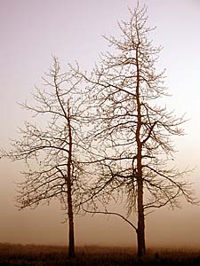
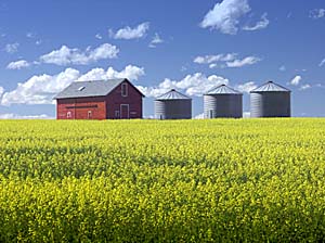
Another type of color contrast is the difference between less saturated colors and brilliant fully saturated colors. A yellow field of mustard with a bright red barn on top of a hill with a clear blue sky makes for a very saturated picture. The soft gentle colors of the sun rising in the morning on a foggy day are unsaturated.
It is important to be aware of color and its contribution to the message that you are trying to with your photographs to get balanced color that flatters the subject of the image; or at least doesn't distract from it.
A photograph's color can be controlled by the selection of a subject and background or by the lighting and atmosphere.
In a digital camera there are settings for selecting the blueness or redness of photograph, or selecting the general level of saturation of colors in a photograph. There's also the ability to correct the colors in a photograph so that white looks truly white. With the film camera the selection of tone can give different levels of saturation of the colors and also correct the color of white in a photograph.
Finally, software or darkroom techniques color can dramatically modify color. With software it's no problem to take a red flower and make it blue or to take the color of skin and make a green.
Space
Now we're our finally taking out the last screws in our pocket watch. A photographer has much more control over what goes into an image than most people would imagine. For example, by simply moving few centimeters this way or that way, the relative locations of the objects in an image can be dramatically rearranged.
Practically speaking it's very important that a photograph have as few distracting elements in it as possible. A tree branch in the wrong place can make an otherwise wonderful picture of, say, an owl, look terrible. Fortunately, it is often as simple as walking to left or right few steps to get rid distracting elements in a picture, if one is aware of them.
But there's another aspect to space to talk about: the effect that one gets by either using a wide-angle or telephoto lens. A wide-angle lens tends to make elements in the picture look like they're further apart. A telephoto lens, on the other hand, tends to compress objects together and make the picture look flatter. A telephoto lens can make an image look more abstract and somewhat like a painting.
Again, with spatial relationships, as with tone and color, the concept of contrast is central to making a good image. In this case contrast means the difference between the apparent distances between objects in the image.
I will only just briefly mentioned it here as an aside, but there is a process called "sharpening" that can be easily accomplished with computer software and can even be done in a conventional darkroom. Sharpening increases the contrast of the edges of objects, enhancing them and making them standout. Sharpening is best done as the very last step in processing an image digitally. Sharpening greatly enhances the quality of an image.
Time
Well, we have just about got all the pieces out of our pocketwatch but we are left with one: how time affects an image.
Almost everybody is familiar with how photography can be used to stop time from the photographs they have seen of bullets that are frozen in mid-air as they go through an apple. These photographs might be taken with an exposure of fractions of 1000th of the second.
Photography can also stretch time. In night photography we can see long dramatic lines of red and white headlights streaking through invisible streets in long exposures of a few seconds or more.
Conclusion
So now we can try to put all the pieces of the watch back together again. Can we learn much about watch making from taking a watch apart? Probably not, but we but it is fun, especially if we are willing to throw it away afterwards.
Tone is like the hands of the watch, it is an essential part of an image. To illustrate this, one can have an image that consists solely of tone, which is of course just a black-and-white photograph, but not one that is just color.

Color, however, is the golden case of the watch. It can make a photograph attractive and beautiful. It is important that color complement the intentions of photographer as opposed to distracting from them. Colors that are overly brilliant might attract attention or even shock as in some contemporary advertisements, but subtle color can have great beauty.
How objects are arranged in the two-dimensional space of a photograph is very important to the message of photograph. If an object central to the subject of photograph is covered up by another the meaning of photograph can be lost.
Finally, by shortening or lengthening the exposure use to make a photograph, time can be frozen or dilated.
I haven't talked at all about apertures or focal lines. I haven't talked about ISO or RAW files. But I have talked about the end result that one wants in a photograph: sparkling tone, harmonious color, and in a well-placed subject.
For me, photography is all about the end result. Unless you're a photographer, when you look at an image you'll rarely ask, "How was that done?" But sometimes photographers will get buried away in the technical details of making an image and forget that they are creating a piece of visual art. This is something that will be enjoyed for only a few seconds, something that perhaps will make a person happy, sad, glad or mad; but and then the person will move on to other immediate and important things in their life.
The End.
Enter a comment..